In this era of fast moving Internet denizens, it has never been easier to get your music out there and recognized. Between the different music hosting websites like SoundCloud, and the ever-growing influence of online artists, music on the Internet is fast outpacing music labels. This is the best time to try your luck in the music scene; of course, there are still some rules on how you should act online. For example, you can’t expect that one little track will get you on the map immediately, and at the same time, you’ll also have to make a website for your tracks. This is where WordPress music themes come in and help you design an awesome website.
10. Dark ‘n Gritty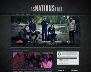
For bands that have a dark aesthetic in mind, themes come sparse because not a lot of music is aimed at the emo crowd. However, there are still a few gems out there that really make the cut because they’re plain old pretty to look at, and are fully functional as well. The theme is mostly colored in blacks and grays, giving it that gothic feel while still using some contemporary design features. The layout is pretty standard though, with featured articles being posted in chronological order and with a SoundCloud widget being posted on the right side of the page.
9. Stylico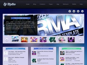
For musicians that work on electronic stuff instead of live band music, Stylico brings a certain flavor into the equation. The overall theme of the template has to do with the neon blue of club lights, and at the same time, photos and galleries are prominently displayed as you first load up the page. There are separate boxes reserved for dates, featured content, as well as the most popular stuff; all three are arranged neatly below the gallery slider.
8. REplay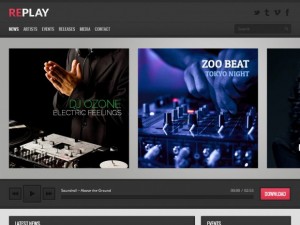
For bands that wish to create a group page as opposed to a page dedicated to just one band, REply is designed for that purpose. It incorporates the standard pages one might find in an artist page, and multiplies them by several pages. They have an artist page, which caters to the individual musicians under the label, and at the same time, all events are organized to an accurate point. This theme really is for a label and the theme is relatively cheap so even independent labels can make use of it.
7. Muzak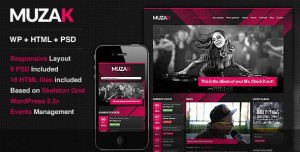
Yet another theme for groups of musicians, Muzak takes a more simplified approach to design. The layout of the main page makes it easy to navigate through the different tracks from each artist, and it also shows off the scheduled gigs with a nifty little descending list on the right hand side of the page. At the same time, it also has a shop and it lists down the exact discography of the artists under the label.
6. Grammy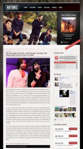
Okay, so the theme itself won’t be winning any distinguished awards, but on the bright side, it presents the band in a very elegant manner. Boasting intuitive design, which allows for a lot of user friendliness, this theme really showcases the band at its best. Of course, the pages may seem a little bear because every piece of media is separated instead of integrated unto the main page. What makes the difference, however, is that each important social network is posted right up front.
5. Night
Night is another one of those dark themes, but instead of trying to appeal to the nitty and gritty, it looks more like a nightclub theme. It incorporates a lot of dark blue coloring with a giant sliding gallery that features both music and photos while it scrolls around. Beyond that, the page is populated with very little, only revealing the most recent posts and the music widget that features the many tracks from the artist.
4. Clubber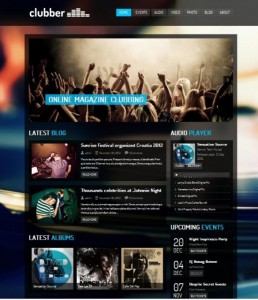
This one is a lot similar to the other club theme earlier on this list. However, instead of being too simple, it uses the space and maximizes it without compromising the look. The theme looks to be one of the more well thought out ones as you simply scroll to find the stuff you want. Everything from the artists is displayed proudly on the main page; simply scroll down and you should be able to see everything from latest blog entries to the upcoming events.
3. Deposito
Sometimes too much clutter can make a band seem too desperate. For artists that don’t want too much attention drawn to specific parts of the page, then Deposito should be the theme you should check out. It has almost zero clutter and is presented in a black, white, and grey finish that works well with how posts are laid out.
2. Setlist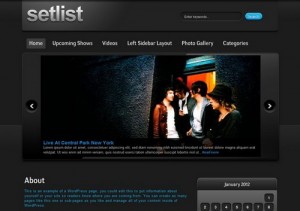
Setlist is a very pretty theme, but at the same time, it is very pricey. However, with so many features stuffed into one theme, it’s impossible not to understand why. It has countless customization options that span from fonts to even the layout of the page. The default positioning is great though, and the live demo can explain more about how great this theme looks.
1. Live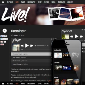
Bands online can produce a lot of great music. Given enough time to do so they can make tons of albums. They can also make great websites that can integrate their material, the tracks they sell, and their future events in one simple package. However, Live adds a little extra dimension. This theme is fully functional on mobile devices, and runs smoother than other themes with the same features.
Leave a Reply